ANATOLY IVANOV / DESIGN / IDENTITY / < >
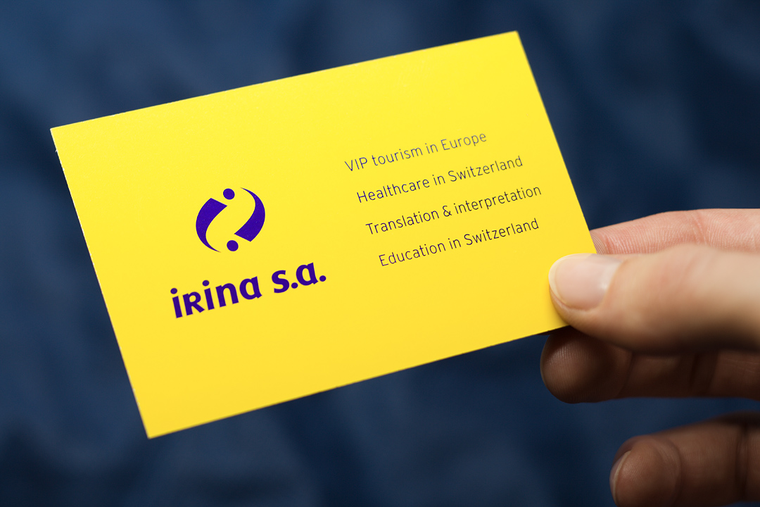
IRINA SA VISUAL IDENTITY (VISIT CARD / VERSO) +
The yellow background suggests the company’s core service – tourism. The color of the sun, joy and communication between people. A high-contrast dark blue logo reads well from any distance. The lower-case letter “r” followed by an “i” could visually merge into an “n”, so I eliminated all doubt with a capital “R”. The graphic above the name symbolizes 2 persons and echoes the 2 letters “i”. The 6 dots form an almost perfect symmetry.