ANATOLY IVANOV / CLIENTS / IRINA SA / < >
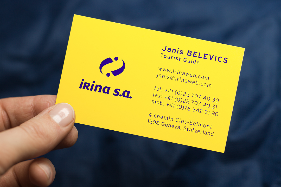
IRINA SA VISUAL IDENTITY (VISIT CARD / RECTO) +
The logo design enhances readability. At any distance, any speed. In color or black and white. The lower-case letter “r” followed by an “i” could visually merge into an “n”, so I eliminated all doubt with a capital “R”. The graphic above the name symbolizes 2 persons – communication and one-on-one service – and echoes the 2 letters “i”. The 6 dots form an almost perfect symmetry.